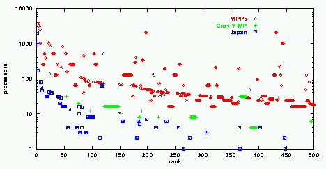

This graph shows the machines in the November '96 Top500 list in rank and number-of-processors coordinates. This list includes information on the 500 most powerful computers in the world, ranked according to their performance on the Linpack benchmark. The graph shows that for any given rank (= level of performance), MPPs need more processors than vector machines. The interesting thing is how the Japanese companies take the concept to the limit. There is complete Japanese domination of the lower-left part of the graph, representing high performance achived by a relatively small number of very powerful processors. A line of Cray Y-MP machines divides the region of Japanese dominance from that of (mostly American) MPPs.
Source: the Top500 list is updated twice a year.
This and additional analyses were published in D. G. Feitelson, “On the interpretation of Top500 data”. Intl. J. High Performance Comput. Applications, 13(2), pp.146-153, Summer 1999.

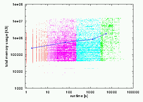
This graph is a superposition of two things. In the background, we have a scatter plot with a dot for each job, representing that job's runtime and memory usage. It is color coded according to a division into 4 equal parts (in terms of number of jobs in each part) based on the runtime. The superimposed line connects the centroids of these four parts: each point is plotted at the average runtime and memory usage for its quadrant. It shows that there is a weak correlation between runtime and memory usage.
Source: the data is from the LANL CM-5, and contains 34777 jobs that ran during January thru September of 1996. See the full paper to learn more about memory usage.